The Rule of Thirds. This is, perhaps, the greatest "rule" of photography, which most people do not understand. Most people, when they approach a subject, want to place that person or thing right in the middle of the frame. But this is not a good idea. Let me simply quote what has been written in Wikipedia on this subject, and hopefully it will make sense to you:
The rule states that an image should be imagined as divided into nine equal parts by two equally-spaced horizontal lines and two equally-spaced vertical lines, and that important compositional elements should be placed along these lines or their intersections. Proponents of the technique claim that aligning a subject with these points creates more tension, energy and interest in the composition than simply centering the subject would.Hence, notice the picture to the right (which is not mine). Most people would simply put the fly
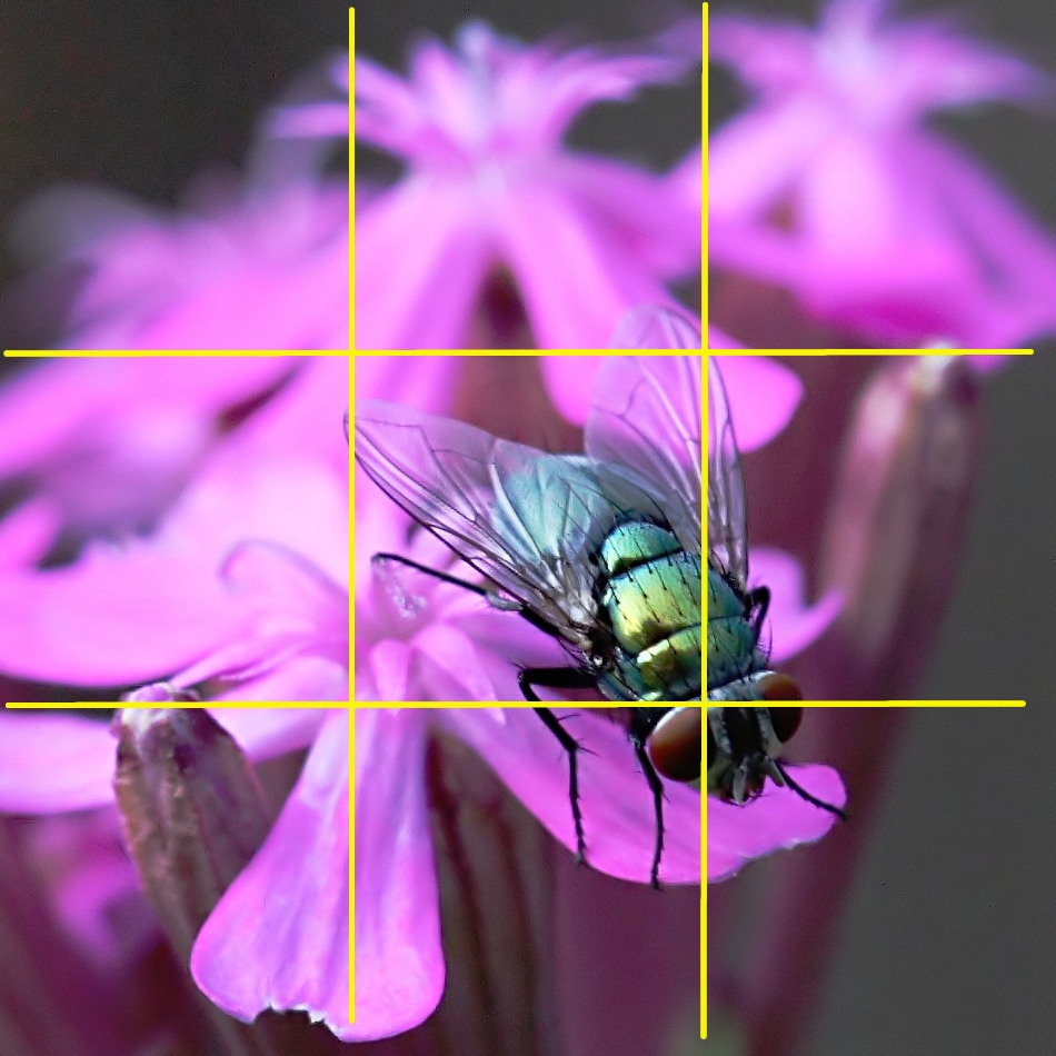 in the center of the frame. However, when approaching the scene, the photographer divided the scene into nine equal parts, and placed the subject (the fly) in one of the thirds of the frame. This can be achieved by essentially imagining the frame as a tic-tac-toe arrangement. Doing thus, you would want the subject of the photo to lie upon one of the lines on that tic-tac-toe board - in this case, the fly's eyes.
Similarly, if you were to take a picture of a person standing on the beach (like the picture below left, which is not my picture either), you would want the person's body to line up on one of those lines as well. This is the case with anything you photograph. If it is a building, or a road, or whatever the case is, always try to arrange that particular subject to be lined up in one of the thirds of the frame.
The same is true when the horizon is in your picture. You never want the line of the horizon right
 in the middle of the frame. You want the horizon line to be in the bottom third of the picture (showing more sky), or the top third of the picture (showing more land/sea). The picture to the left has both of these elements. The girl is, first of all, lined up on the right third of the picture, and then the horizon is - for the most part - lined up on the top third of the frame. Success!
At the same time, perhaps it would be well to address something that may come up again later. When you are taking a picture of a person - especially - you must ask yourself how much of that person you want in the picture. Generally speaking, if you are getting the person's whole body in the picture, you then want that person's body to be placed on one of the thirds of the picture (like the picture above). However, if you want a close-up picture (for more formal portraits), it is totally fine to have the person in the middle of the frame. However, the rule of thirds still applies because in the latter case, you still want the person's eyes to be in a third. When we look at people, the first thing we look at is that person's eyes. Thus, it is preferable to make sure that the person's eyes is in one of those thirds (usually the top third).
So how do you make a decision as to whether you take a picture of a person's whole body (thus placing the whole body on a third), or just their face, for example? It depends on the situation. If
 you want to emphasize where a person is, or what he or she is doing, then you might want the whole body (or most of it), and thus place his or her whole body in one of the thirds. The example to the right, of my niece Calleigh, shows this. I wanted to emphasize the fact that she was walking her dogs, and so, obviously, I wanted to get both her and the dogs in the frame. But I still wanted to keep her in one of the thirds. I also got them, for the most part, in one of the thirds. Notice, also, that her eyes are still in one of the thirds - almost exactly where two of the lines would intersect.
Similarly, if I want to emphasize the fact that my wife is in Paris, then I would take a picture that not only shows her, buth also something from Paris as well. I will put her whole body on one of the third lines, and then place the particular scene where she is located in the other part of the frame. By placing her in only one third of the scene, my eye can be drawn in from the rest of the picture.
On the other hand, if I don't care that much about the where a person is located or what he or she is doing, then it is more likely that I will zoom in and include less of his or her body. In other words, if I am taking a picture of my wife, and I don't care if the person looking at the picture knows she's in Paris or Los Angeles, then I will probably zoom in closer on her. This is especially the case when you are taking more formal portrait pictures. If you just want a nice shot of your wife or girlfriend or son to hang up on your wall, and it doesn't matter where he or she is, then you will want to get as close as possible. Of course, as I said earlier, you still want the person's eyes to be in one of the thirds.
The Rule of Thirds also applies to landscape or cityscape photography as well. If you are taking a picture of a building, for example, you most definitely want that building to be in one of the thirds. This allows the building to be in context, helping the viewer to understand the overall scene, rather than simply the subject itself. Notice, for example, the picture below. For the most part, the main subject of the picture is the covered bridge. But instead of simply having the covered bridge in the picture, I also had the stream in it. The stream leads your eye into the picture, until it ultimately settles on the bridge in the top third of the frame.
 By the way, as a bonus: what other photographic techniques did I use in this picture to make it interesting? Answer: I naturally wanted as much of the picture to be in focus as possible. Thus, I used a small aperture (high f-stop), which also forced me to use a slow shutter speed. But that was actually preferable, because that allowed me to blur the water, which was moving, thus producing that nice silky effect.
Less is More. This rule somewhat ties in with something I mentioned in the previous point, but often times less is more. What do I mean? When you approach a scene - whether it is of a person or a skyline or a field of flowers - you want to figure out what the subject of that picture is going to be, and then try to eliminate all the unnecessary components of the scene. In other words, you want to take account of every inch of your frame and make sure that no part of the scene causes the viewer to be confused as to what, exactly, you're focusing on. This is often one of the other most neglected rules.
Take the image to the right, for
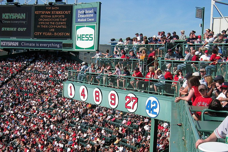 example, which is not mine. Can you tell me what, exactly, the person who took the picture wants you to focus on? When I look at the picture, my eye naturally races around to pick up on something to focus on. But I can't figure out what the photographer wants me to look at. I'm not sure if he/she wants me to notice all of the fans; or maybe the scoreboard; or maybe the retired numbers; or what, exactly. Actually, if it wasn't for the fact that the person who took the picture said on his/her website that he/she was showing the retired Red Sox numbers, I wouldn't have known that this was the focus of the picture.
If the person wanted to make that the subject of the picture, it would have been better off if he/she had zoomed in more on the numbers, and eliminated the distracting elements of the scene. This doesn't mean that he/she would have had to eliminate all other elements, but keep only those things that are necessary to be able to tell the viewer what these numbers were all about.
Notice, also, the two pictures below - both of the same scene, for the most part. Obviously, there are other things going on in the pictures that cause one to be better than the other, but tell me what the focus is of the first picture, and then what the focus is of the second picture.


Both pictures have water, but whereas the first picture has a lot of water, the second picture has just enough to let the viewer know that this is a water scene. For the most part, nothing in the second picture is unaccounted for, and thus it doesn't confuse the viewer. The viewer knows what the subject of the picture is. The subject (and when we use the word "subject," this doesn't necessarily have to be only a physical subject; the subject could also simply be an idea) is a fisherman in his boat, getting ready to head out to sea. Everything else in the pictures simply sets the scene up, allowing the viewer to know the context in which this is taking place.
The first picture, however, doesn't necessarily tell us what is going on. We are not sure if we are supposed to focus on the buildings, or the water, or the boats, or the buoy. The whole frame is not accounted for by the photographer. There is a lot of wasted space that doesn't necessarily contribute to what the photographer is trying to get us to focus on, or think about.

Thus, every inch of the frame needs to be accounted for. This doesn't mean that you cannot have large parts of a picture that are wide open - like a huge sky. It just means that every part of the frame needs to contribute to the subject or story or feeling or emotion that you are trying to emote from any picture.
Another shot I took from this same scene is to the left. I have a lot of sky in the shot. But what does that sky tell you? The sky tells the story that this is an early morning setting, and the sun is just coming up. Because there is pink in the clouds, this alerts the viewer that the scene is in the morning, and the Harbor (in this case, Boothbay Harbor, Maine) is just coming to life.
Thus, if you are going to have large parts of your picture that is the same thing (ie, sky, water, open field), that part must contribute to the story that you are trying to emote in that scene. A lot of sky in a picture may give the sense of a wide-open vista scene, for example. Or a lot of water (in an ocean-scene, for example) may emote the feeling of bigness or vastness.
When I take a picture, I am actively trying to focus in on only those parts that I need. I hate wasted space - parts of the frame that contain only one element. In the picture above (the second picture in the series of two), had the area to the left of the island been wide open, with only water or sky, for example, I probably wouldn't have been excited about the picture. But because there are buoys and other boats in the water, and there is a building in the far shore, I took the picture. These things don't necessarily distract from the main subject of the scene because of where they are positioned in the frame, but they also provide a context for the fisherman and his boat. Wide open water would have told the viewer, "Okay, there is water there: but why do I need to see so much of it?"
Thus, to reiterate it: less is more. Try to eliminate anything in the frame that is not necessary to the overall explanation of what is going on, or the scene you are trying to capture.
Framing. This idea is closely related to the previous two points that I mentioned, but it can go a long way in helping the viewer understand the context in which the scene is located, as well as forcing the viewer's eye to focus on the main subject of the picture. Framing occurs when you take natural elements in a scene that can set a "frame" around your main focus. One of the most common ways that this is accomplished in a city or landscape scene, is by including a tree or branches in the foreground of the picture. This thus turns the viewers eye towards the main subject of the scene. The picture below of Dartmouth College illustrates this.
 The main subject of the picture is the building (and more specifically the door), but in order to get the viewer's eye to focus on the door, instead of the rest of the building, I utilized the leaves to frame the picture and turn the viewers eye towards the door. Of course, the leaves also served as an added bonus because, since they are yellow, it tells the viewer that this is a fall scene. But because the leaves on top do not take up most of the picture, nobody would believe that there are the main focus of the shot. The viewer knows that they are simply there to lead your eye to the main focus.
At the same time, it also helps, of course, that the door is in one of the thirds! This allows the eye to look at the rest of the picture, understanding the context of what is going on, before settling on the door.
The next picture below also utilizes a natural frame to get the viewer to focus on the main subject - namely, my brother-in-law and niece. That the leaves in the foreground are out of focus (not to mention all other elements of the picture besides to two of them) also helps direct the eye towards the main subject, since they are the only thing in focus.
 With this picture, it's almost as if the out-of-focus leaves in the foreground serve as a "funnel" that naturally funnel your vision towards Calleigh. Your eye doesn't wander around the rest of the picture and settle on anything else (unless you purosely and consciously do so). Yet, at the same time, the rest of the scene does allow you to understand the context in which Duncan and Calleigh are in. They are in a field, picking raspberries. If I simply wanted to take a picture of Calleigh, and not tell the viewer what she was doing, I would have focused closely on her and eleminated everything else.
Go Crooked. This last rule of composition is anything but a rule, and it applies only to a certain type of photography. I have never learned it in a class, or seen someone explain its purpose on a website, but I started noticing a couple of years ago that when wedding photographers, or photojournalists, or advertisement photographers, took pictures of people, they often tilted the camera little bit. Thus, instead of getting a straight image, the scene would be titled a little bit (the above picture is an illustration of this).
I am not sure what this accomplishes, or why it is necessarily more interesting than a straight-up-scene, but it does something to the eye that is out of the ordinary. It may just be that it provides a perspective that we don't typically see.
As I said, this should only be done with certain types of photography. You won't want to do this necessarily with landscape or cityscape shots. And, generally, you probably won't do this for formal portrait pictures. But it is a very good technique for candids and photojournalistic scenes (in other words: if you were taking pictures of soldiers in Afghanistan for a newspaper). For the most part, I use this technique almost all the time when I am taking candid shots and I have found that it adds a lot of interest to the scene. Notice the picture below to see what I'm talking about. And perhaps someone who is more inteligent than I can tell me why this is more interesting to the viewer than if the person were simply straight in the shot.
 Now, for the most part, you don't want to go "buck wild" with how crooked you take the picture. Just tilting your hands slightly should be enough. But, of course, you can experiment with this technique and decide what is best.
So these are probably four of the main rules of composition that I want to hit upon. There are other important parts of course that I could mention, of course, but these four things are probably four of the most important rules of composition that I keep in mind (or subconsciously do) when I'm taking pictures. For other tips on composition, type of "Rules of Composition" in a Google search and you'll come up with all kinds of other helpful suggestions.
Now we'll turn to some other practical things you can do to improve your photography. For that, we go to Part 3.


No comments:
Post a Comment